
| 일 | 월 | 화 | 수 | 목 | 금 | 토 |
|---|---|---|---|---|---|---|
| 1 | 2 | 3 | 4 | 5 | 6 | |
| 7 | 8 | 9 | 10 | 11 | 12 | 13 |
| 14 | 15 | 16 | 17 | 18 | 19 | 20 |
| 21 | 22 | 23 | 24 | 25 | 26 | 27 |
| 28 | 29 | 30 |
Tags
- cs231n
- On-memory file system
- BFS
- Process
- Multimedia
- Gentoo2
- file system
- deep learning
- CPP
- Operating System
- CNN
- Baekjoon
- Robocup@Home 2026
- Seoul National University
- Python
- computer vision
- SQLD
- ROS2
- 밑바닥부터 시작하는 딥러닝2
- Data Science
- System Call
- paper review
- C++
- RNN
- Linux
- Humble
- Machine Learning
- do it! 알고리즘 코딩테스트: c++편
- DFS
- Optimization
Archives
- Today
- Total
newhaneul
[Advanced Python Programming] Lecture 13. Data Visualization 본문
4. University Study/Advanced Python Programming
[Advanced Python Programming] Lecture 13. Data Visualization
뉴하늘 2026. 5. 25. 02:29728x90
포스팅은 인하대학교 허혜선 교수님의 [202601-EEC3408-001] 고급파이썬프로그래밍을 수강하고 공부한 내용을 정리하기 위한 포스팅입니다.
1. 그래프 그리기
선 그래프 그리기
- 선과 데이터 마커 설정
- plt.plot(x, y, color=선 색상)

- 선과 데이터 마커 설정
- plt.plot(x, y, linestyle=선 모양)

import matplotlib.pyplot as plt

year = [2014, 2015, 2016, 2017, 2018, 2019, 2020, 2021, 2022]
gdp = [3079.9, 3250.1, 3398.8, 3574, 3678.2, 3721.8, 3744, 4003.6, 4165.5]

plt.figure(figsize=(6, 4))
plt.plot(year, gdp, color='m', marker='.', linestyle='-')
plt.title('GDP per capita')
plt.xlabel('years')
plt.ylabel('ten thousand won')
plt.ylim(2500, 4500)
plt.show()
- 여러 개의 선이 있는 그래프 그리기
- plt.legend(): 범례
plt.plot(x, y, label=레이블)
plt.legend()
import matplotlib.pyplot as plt
year = [2010, 2011, 2012, 2013, 2014, 2015, 2016, 2017, 2018, 2019, 2020, 2021, 2022]
seoul = [12.1, 12, 12.2, 12.5, 13.4, 13.6, 13.6, 13, 12.9, 13.5, 13.2, 13.7, 13.2]
jeju = [15.6, 15.6, 15.7, 16.5, 16.2, 16.7, 17, 16.8, 16.6, 16.8, 16.7, 17.5, 17]
plt.figure(figsize=(5, 3))
plt.plot(year, seoul, label='seoul', linestyle='-')
plt.plot(year, jeju, label='jeju', linestyle='--')
plt.ylim(10, 20)
plt.title('temperature')
plt.xlabel('years')
plt.legend()
plt.show()
막대 그래프 그리기
import matplotlib.pyplot as plt

season = ['spring', 'summer', 'autumn', 'winter']
precipitation = [330.5, 612.8, 256.4, 13.3]

plt.figure(figsize=(5,3))
plt.bar(season, precipitation)
plt.title('precipitation')
plt.ylabel('mm')
plt.show()
산점도 그리기
import matplotlib.pyplot as plt

years = [2000, 2005, 2010, 2015, 2020]
single_person = [15.5, 20.0, 23.9, 27.2, 31.7]
baby_born = [640089, 438707, 470171, 438420, 272337]

plt.figure(figsize=(5,3))
plt.scatter(single_person, baby_born, s=20, c='lightslategray', marker='x')
plt.xlabel('signle-person household ratio')
plt.ylabel('the number of babies born')
plt.show()
- 리스트 조건식을 사용하여 산점도의 색상을 설정
import matplotlib.pyplot as plt

height = [156.9, 159.9, 153.5, 151.2, 154.6, 168.3, 165, 154.7, 146, 152.4]
weight = [48.7, 58.5, 48.4, 39, 58.9, 80.8, 59.3, 49.4, 35.3, 51.8]
gender = ['f', 'f', 'f', 'f', 'f', 'm', 'm', 'm', 'm', 'm']

colors = ['r' if a == 'f' else 'b' for a in gender]
plt.figure(figsize=(5,3))
plt.scatter(height, weight, s=10, c=colors)
plt.xlabel('height')
plt.ylabel('weight')
plt.show()
- 점에 주석 추가하기
import matplotlib.pyplot as plt
plt.annotate(주석, 주석 대상 위치, xytext=주석 위치, textcoords=단위)
import matplotlib.pyplot as plt
name = ['Jessica', 'Liam', 'Sophia']
x = [75, 92, 83]
y = [79, 89, 90]
plt.figure(figsize=(5,3))
plt.scatter(x, y)
plt.annotate(name[0],(x[0],y[0]),xytext=(5,-10),textcoords='offset points')
plt.annotate(name[1],(x[1],y[1]),xytext=(5,-10),textcoords='offset points')
plt.annotate(name[2],(x[2],y[2]),xytext=(5,-10),textcoords='offset points')
plt.xlim(73, 95)
plt.ylim(75, 93)
plt.xlabel('X')
plt.ylabel('Y')
plt.show()
히스토그램 그리기
import matplotlib.pyplot as plt

temperature = [6, 2.2, 4.6, 7.7, 8, 9.2, 11.7, 12.5, 10.3, 13.5,
                15.2, 5.9, 2.9, 9.2, 8.6, 4.6, 7.2, 7.7, 8.3, 9.5,
                13, 17, 17.4, 12.5, 12.5, 9.4, 7.3, 9.2, 11.8, 13.3, 15]

plt.figure(figsize=(5,3))
plt.hist(temperature, bins=15, alpha=0.5)
plt.xlabel('temperature')
plt.ylabel('frequency')
plt.show()
LAB 혈액형 빈도수 시각화하기

import matplotlib.pyplot as plt

blood = {'A':0, 'B':0, 'O':0, 'AB':0}

while True:
    s = input('혈액형(A, B, O, AB) 또는 종료')

    if s == '종료':
        break
    else:
        blood[s] += 1

plt.figure(figsize=(5,3))
plt.bar(blood.keys(), blood.values(), width=0.5)
plt.title('blood')
plt.xlabel('blood type')
plt.ylabel('frequency')
plt.show()
LAB 난수를 이용하여 히스토그램 그리기
import matplotlib.pyplot as plt
import random

x = [random.normalvariate(0, 1) for _ in range(100000)]

plt.figure(figsize=(5,3))
plt.hist(x, bins=30, alpha=0.5)
plt.ylabel('frequency')
plt.show()
2. 이미지 다루기
- plt.imread(이미지): 이미지 파일을 읽어들인다.
- plt.imshow(이미지): '이미지'를 화면에 표시한다.
import matplotlib.pyplot as plt

cat = plt.imread('고급 파이썬 프로그래밍(허혜선)2026-강의노트\cat1.jpeg')
plt.imshow(cat)
plt.show()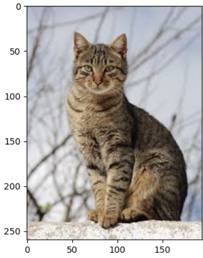
- plt.axis('off'): 축과 눈금이 출력되지 않도록 설정
- plt.savefig(이미지명): 출력 결과인 이미지 또는 그래프를 파일로 저장한다.
- plt.subplot(행의 수, 열의 수, 인덱스): 여러 개의 이미지 또는 그래프를 한 화면에 나타낸다.

import matplotlib.pyplot as plt

cat1 = plt.imread('고급 파이썬 프로그래밍(허혜선)2026-강의노트\cat1.jpeg')
cat2 = plt.imread('고급 파이썬 프로그래밍(허혜선)2026-강의노트\cat2.jpeg')
imgs = [cat1, cat2]

plt.figure(figsize=(5,3))

for i in range(len(imgs)):
    plt.subplot(1, 2, i+1)
    plt.imshow(imgs[i])
    plt.axis('off')
plt.show()
- plt.xticks([]): x축 값을 빈 리스트로 설정
- plt.yticks([]): y축 값을 빈 리스트로 설정
import matplotlib.pyplot as plt

cat1 = plt.imread('고급 파이썬 프로그래밍(허혜선)2026-강의노트\cat1.jpeg')
cat2 = plt.imread('고급 파이썬 프로그래밍(허혜선)2026-강의노트\cat2.jpeg')
imgs = [cat1, cat2]
labels = ['cat', 'cat']
plt.figure(figsize=(5,3))

for i in range(len(imgs)):
    plt.subplot(1, 2, i+1)
    plt.imshow(imgs[i])
    plt.xticks([])
    plt.yticks([])
    plt.xlabel(labels[i])
plt.show()
- 폴더 안의 이미지 출력하기
- imgs = os.listdir('경로')
import matplotlib.pyplot as plt
import os

imgs = []
for i in range(1, 5):
    imgs.append(f"cat{i}.jpeg")

for i in range(len(imgs)):
    plt.subplot(2, 2, i+1)
    img = plt.imread(os.path.join('고급 파이썬 프로그래밍(허혜선)2026-강의노트', imgs[i]))
    plt.imshow(img)
    plt.xticks([])
    plt.yticks([])
    plt.xlabel('cat')
plt.show()
LAB 주사위 굴리기
import matplotlib.pyplot as plt
import random
import os

imgs = os.listdir('고급 파이썬 프로그래밍(허혜선)2026-강의노트\dice')
plt.figure(figsize=(5,3))
for i in range(2):
    plt.subplot(1, 2, i+1)
    select = random.randint(1, 6)
    img = plt.imread(os.path.join('고급 파이썬 프로그래밍(허혜선)2026-강의노트\dice',imgs[select-1]))
    plt.imshow(img)
    plt.xticks([])
    plt.yticks([])
    plt.xlabel(f"dice{select}")
plt.show()
3. [플러스 예제] 인기 강좌의 빈도수 그래프
import matplotlib.pyplot as plt

course = {'TOEIC':0, 'TOEFL':0, 'TOEIC SPEAKING':0, 'OPIC':0, 'IELTS':0}

print("수강하고 싶은 강좌를 입력하세요.")
print("복수 개의 강좌를 입력하려면 콤마로 구분하세요.")

while True:
    s = input('TOEIC, TOEFL, TOEIC SPEAKING, OPIC, IELTS, 종료: ')

    if s == '종료':
        break
    for a in s.split(','):
        if a in course:
            course[a] += 1
        else:
            print(f'{a}는 등록되지 않은 강좌입니다.')

for key, value in course.items():
    print(key, value)

plt.figure(figsize=(5, 3))
plt.bar(course.keys(), course.values(), color='g', width=0.5)
plt.title('preferred english course')
plt.xlabel('english course')
plt.ylabel('frequency')
plt.show()
728x90
'4. University Study > Advanced Python Programming' 카테고리의 다른 글
| [Advanced Python Programming] Lecture 16. Web Scrapping (0) | 2026.05.27 |
|---|---|
| [Advanced Python Programming] Lecture 15. Web Crawling (0) | 2026.05.27 |
| [Advanced Python Programming] Lecture 12. Pandas (0) | 2026.05.24 |
| [Advanced Python Programming] 중간고사 암기 (0) | 2026.04.17 |
| [Advanced Python Programming] Lecture 11. Numpy (0) | 2026.04.17 |
'4. University Study/Advanced Python Programming' Related Articles
more


